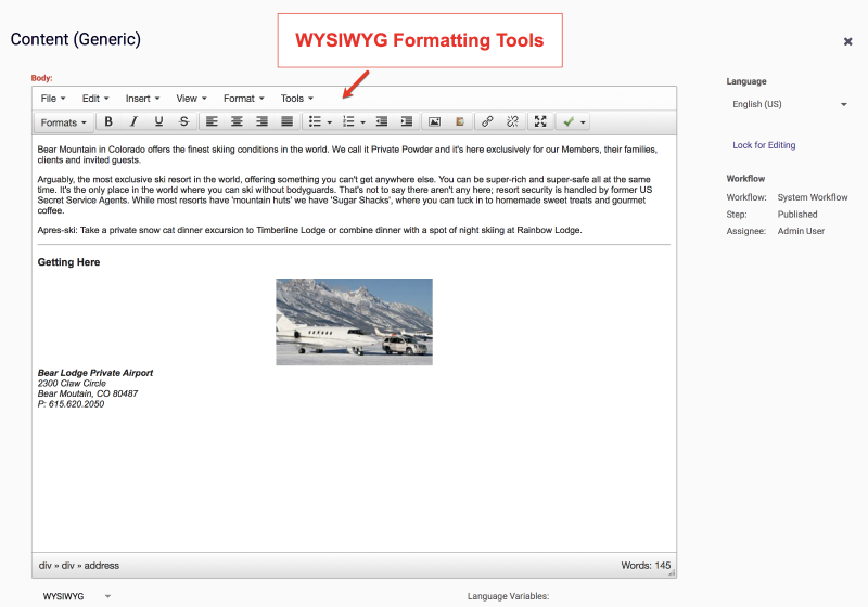
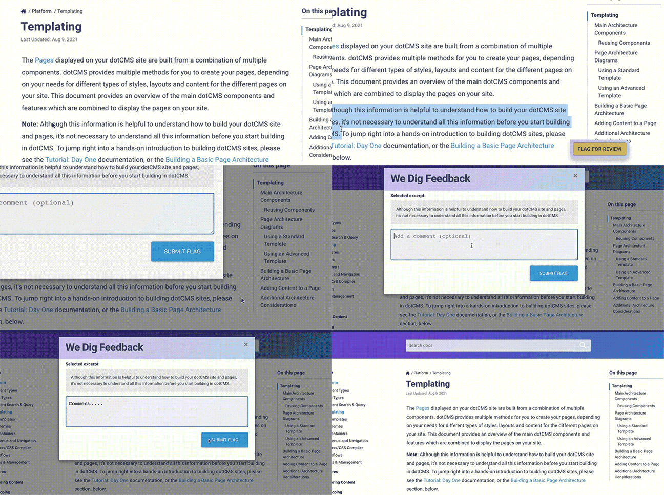
The WYSWYG (What You See Is What You Get) editor allows you to create content with word processor-like formatting. You can type in text and apply styles to it (make it bold, italic or change the text color for example), insert links and images, and add other content and formatting, with all changes visible in the editor similar to how they will be shown on the front-end site.
dotCMS uses TinyMCE 4.9.6 as its base WYSIWYG. Please make a note of this when looking at any TinyMCE documentation.
The Body field of the Content Type displayed in the image below is a WYSIWYG field.
Editor Buttons
The following list shows the icons for the formatting buttons in the WYSIWYG editor, and a brief description of their functions:
| Button | Description | Button | Description |
|---|---|---|---|
 | Toggle bold |  | Toggle strikethrough |
 | Toggle italics |  | Decrease indenting |
 | Toggle underline |  | Justify text across element |
 | Align text left |  | Insert image from Site |
 | Align text center |  | Insert image from Image Editor |
 | Align text right |  | Insert hyperlink |
 | Toggle bulleted list |  | Remove hyperlink |
 | Toggle numbered list |  | Show editor full-screen |
 | Increase indenting |  | Validate content Accessibility |
Inserting Paragraphs and Single Line Breaks
As you enter text, pressing <Enter> starts a new paragraph (which leaves spacing between the previous paragraph and the new paragraph). To insert a single line breaks (without starting a new paragraph, and thus without added space between lines), <Shift> + <Enter>.
 Inserting Links
You can add either web page links or email links within your content using the Link button. Here are the options available:
| Link URL: | For a web link, enter the full web address starting with https:// and for a email link enter mailto: followed by the email address. |
| Target: | By default links will open in the same browser window. To have links open in a new browser window, select "Open link in new window" from the dropdown list. |
| Title: | Enter the text your want to have appear when a user mouses over the link (ex. Click here for more information) |
 Inserting Images
To insert online images into your content, use the Image button. The following properties may be set on an inserted image:
| Property | Description |
|---|---|
| Image URL | URL of the image file to display Note: This may be any image accessible by a URL, including an image file on your dotCMS system, an image in a Binary field, or an image from an external site |
| Image Description | Description to display in the alt text |
| Alignment | Image alignment (selected from the dropdown) |
| Dimensions | Image width and height Note: The width and height are automatically set from the included image, but may be manually adjusted |
| Border | Width of the image border (pixels) |
| Vertical Space | Amount of space above and below the image (pixels) |
| Horizontal Space | Amount of space to the left and right of the image (pixels) |
Image URL Format
When you insert an image into the WYSIWYG editor, dotCMS automatically inserts the image link using a specific format. You may manually edit the link to change the format (for example, to specifically add a reference to the dotCMS Site rather than using a relative link), and you may change the format used to insert new links.
Image URL Format Pattern
You may change the format that the WYSWIWYG editor uses to insert links via environment variable — such as by specifying the DOT_WYSIWYG_IMAGE_URL_PATTERN property in your orchestrator YAML.
The value of the WYSIWYG_IMAGE_URL_PATTERN property can include the following variables, which will be replaced by the appropriate values when a new link is inserted:
| Variable | Replaced with |
|---|---|
{name} | The name of the page or file |
{path} | The path to the page or file |
{languageId} | The language ID of the page or file |
{hostname} | The hostname of the Site the page or file is located on |
{extension} | The extension of the page or file referenced |
{inode} | The inode of a file or page in your dotCMS instance |
{identifier} | The identifier of a file or page in your dotCMS instance |
{shortyInode} | The 10 digit inode (shorty ID) of a file or page in your dotCMS instance |
{shortyIdentifier} | The 10 digit identifier (shorty ID) of a file or page in your dotCMS instance |
Important: Variables will be replaced with the appropriate values at the time the link is inserted into the WYSIWYG editor.
- For example, if a page or file is moved to another folder after a link referencing the
{path}is inserted, the link will no longer work because the path of the file will not longer match the path in the link. - If you want to ensure that a link works even though the page or file is later changed, consider referencing the
{inode}or{identifier}in the link pattern (and see the other example formats, below).
Default Format
By default, links will be inserted into your content using the following format:
WYSIWYG_IMAGE_URL_PATTERN=/dA/{shortyInode}/{name}
This format inserts links relative to the root of the site in which your content is located, so with this default format, the links will work normally as long as the content is referenced from within the same site (but may not work if the content item is referenced from another site within the same dotCMS instance).
Example Formats
The following are some other patterns you may wish to use to change the way links are inserted into the WYSIWYG editor:
| Format | Property Value | Note |
|---|---|---|
| Include the hostname | //{hostName}{path}{name}?language_id={languageId} | Ensures that the content can be referenced from another site within the same dotCMS instance |
| Force the use of a CDN | //cdn.cloudfront.dotcms.com{path}{name}?language_id={languageId} | Useful when you use static publishing to a CDN |
| Permanent link | /dA/{identifier}/{name}?language_id={languageId} | The link will continue working even if the file or page name (and/or path) is changed (but will always show the most recent version of the page or file, wherever it's located) |
| Link to specific version | /dA/{inode}/{name} | Always links to the specific version of the page or file at the time the link is inserted (ignoring any newer versions of the page or file) |
| Shorty URL | /dA/{shortyId}/{name}?language_id={languageId} |
Changing the Image URL Format
Important: When you change the value of the WYSIWYG_IMAGE_URL_PATTERN property, it only changes how new links are inserted. Any links which have already been inserted will not be changed. To change the format of an existing link, edit the link using the Link button in the WYSIWYG editor.
 Resizing the Editor Window
The size of the WYSIWYG editor can be increased or decreased by dragging the lower right corner handle.
 Full Screen Mode
To expand the editor window to full screen mode, click the Full Screen button. To return the WYSIWYG editor to the original size, click the Full Screen button again.
Viewing and Editing Source Code
To view or edit the HTML code of the content in the editor — or to more directly work with code of a different type, such as Markdown — select the Code option from the lower-left dropdown. In this mode, you may make changes to HTML code directly, or other plaintext manipulation of code.
When switching from existing rich-text content, all existing HTML source code will be populated automatically in the code view. When switching from code to WYSIWYG rich text, a dialog will notify you that switching to code may cause some custom code information to be lost, and prompt confirmation before switching.
The code editor's styling may be adjusted independently through the monacoOptions field variable.
Note: When accessing content through Velocity, the presence of executable Velocity code in a WYSIWYG field may cause an error when calling the field via the content object. In such cases, using the code view to explicitly encode
$as$(for example) can avert this issue.
Language Variables
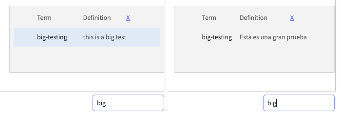
At the lower right corner, an input field allows selection of language variables by way of an autocomplete list. The popup list includes both the language variable term and its definition, if present, for the current content language version — i.e., as determined by the Language dropdown in the contentlet editor's right-hand toolbar.
For example, the following image shows how the same variable displays in English- and Spanish-language locales.
Selecting the term inserts following code into the WYSIWYG field:
$text.get('{SELECTED_LANGUAGE_VARIABLE_TERM}')
Customizing the Editor
You may customize the display and behavior of the WYSIWYG field in two ways:
- Set global defaults by following Global Defaults (see below).
- Change individual WYSIWYG fields using Field Variables (see below).
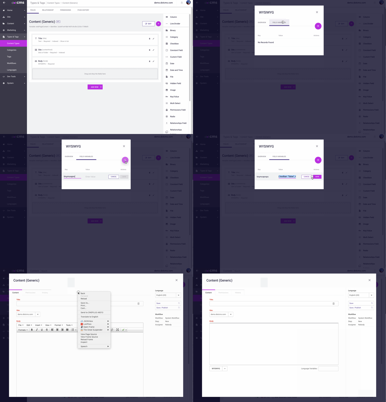
Setting Global WYSIWYG Configuration
- Go to your Site, and create the following folder path: /application/wysiwyg/
- Under that folder, you can upload a VTL file called
wysiwyg-minimal.vtlwith your specific TinyMCE configuration data. For example:{ menubar: false, statusbar: false, resize: false, height: "200px", toolbar1: "bold italic bullist numlist outdent indent", convert_urls: false, } - Go to your Content Type, and edit the specific WYSIWYG field you want to configure. In there, click the
FIELD VARIABLEStab, and add the following data in the Value field:#dotParse("/application/wysiwyg/wysiwyg-minimal.vtl")
From now on, that WYSIWYG field will pick up the configuration parameters you set in the wysiwyg-minimal.vtl file. This way, you can update your TinyMCE configuration in just one place.
Field Variables
Field variables are a simple, powerful way to configure individual field behaviors. For a more general overview, see the Field Variables document.
Setting a Default Path
To set a default path for file dialogs, set a field variable with a key of defaultPath and a value of the path in question — e.g., /images/party.
Preventing Drag and Drop Image Upload
By default, images can be dragged and dropped into the WYSIWYG Field. If you would like to disable this behavior, you can do this by adding the field variable dragAndDrop to the WYSIWYG Field with a value with false.
monacoOptions
The monacoOptions variable adjusts the display of the code editor mode of the WYSIWYG field. It accepts as value a JSON object containing any of an assortment of configurable properties listed here. E.g.:
{"fontSize":18,"wordBreak":"normal"}
tinymceprops
This field variable is significantly more complex, and will be treated more fully in its own section below.
The tinymceprops Field Variable
You may set the tinymceprops field variable in individual WYSIWYG fields to change the display and behavior of each WYSIWYG field individually. This allows you to change how the WYSIWYG field displays and behaves from Content Type to Content Type, and even for different WYSIWYG fields within the same Content Type.
The value of the tinymceprops field variable takes a JSON object which contains a list of properties and property values. The properties that can be set within the field variable are shown below, along with the default values for each property. If any of these properties are set in the tinymceprops field variable, the value of the property overrides the default value for that WYSIWYG field only. If a property is not set in the tinymcepProps field variable, the default value for that property (as shown in the lists below) is used.
Editor Display
The following properties control how the edit control is displayed on the the content editing screen.
Field Size
The following properties allow you to specify the size of the field, and whether or not the user can manually resize the field:
| Property | Default Value | Description |
|---|---|---|
width | Automatic | Sets the width of the field. |
height | Automatic | Sets the height of the field. |
resize | "both" | Determines whether the WYSIWYG field can be resized in the content edit window. Valid values are false (to disable resize completely), true (to enable vertical resize only) or the string "both" (to enable resize in both directions). |
Style and Controls
The following properties allow you to specify which controls, control bars, and options are available to users:
| Property | Default Value | Description |
|---|---|---|
theme | "modern" | Choose from simple, modern, and advanced.The theme determines the base values for all display options, and all the properties shown here will override the default settings from the theme. |
menubar | true | Display the menu bar at the top of the field. |
statusbar | true | Display the status bar at the bottom of the field. |
toolbar1 | See below | Specify which buttons are displayed on the Toolbar. To completely disable the Toolbar, set toolbar1 to "false". |
Note that you may also choose to change how the field displays for different users, or based on other conditions, using Velocity code. For more information, please see Conditional Customization and Changing Editor Configuration Based on User Role, below.
Content Formatting Properties
The following properties control how content is formatted within the editor and entered or pasted into it.
| Property | Default Value | Description |
|---|---|---|
apply_source_formatting | true | Apply some source formatting to the output HTML code. |
convert_urls | true | Automatically convert URLs typed to either relative or absolute URLs (based on the value of the relative_urls parameter).Note: If set to false, user-entered URLs may sometimes be invalid in the saved content. |
document_base_url | "/" | Specifies the base URL for all relative URLs in the document. See also the relative_urls property. |
image_advtab | true | Adds an “Advanced” tab to the image dialog allowing you to add custom styles, spacing and borders to images. |
paste_auto_cleanup_on_paste | true | If set to true, contents will be automatically processed when you paste using Ctrl+V or similar methods.If set to false, contents will not be processed until the content is saved. |
paste_strip_class_attributes | "all" | Enables stripping of class attributes in pasted text. Valid values are “none”, “all”, and “mso” (strip Microsoft classes only). |
paste_use_dialog | true | Pop-up a dialog with choices when a user pastes into the field. |
relative_urls | true | If set to true, all URLs used when inserting images and other files will be relative from the specified document_base_url.If set to false, all URLs will be converted to absolute URLs. |
trim_span_elements | false | Trim <span> elements within the editor. |
valid_elements | "*[*]" | Defines which HTML elements will remain in the edited text when the editor saves. You can use this to remove HTML elements from the text, by limiting the returned HTML to a whitelisted subset of elements. |
verify_css_classes | false | Remove elements with a class that doesn't exist in the CSS. |
Spell Check Options
The following two options control whether the browser spell check functions are enabled in the WYSIWYG field. For a number of reasons, it is recommended that you enable both these options to use the browser's spell check function.
| Property | Default Value | Description |
|---|---|---|
browser_spellcheck | true | Enable the browser spellcheck function in the field. |
gecko_spellcheck | true | Enable gecko-based browser spell check function in the field. |
Note: If you wish to enable browser spell check functionality, both of these properties should be set to true to ensure the functionality works in all browsers.
Toolbar Buttons
You can control which buttons are displayed on the WYSIWYG field toolbar with Toolbar properties in the tinymceprops field variable. The Toolbar properties can be one or more properties, beginning with toolbar and ending with a number, e.g. toolbar1. Each Toolbar property takes a string where each button is represented by a specific button name (see list below). Buttons names are separated by spaces, and you may separate buttons into sections within any Toolbar by inserting the pipe (|) character between two buttons.
If you specify the toolbar1 property in the tinymceprops field variable, all the default buttons on the Toolbar (as determined by the theme property - see above) will be replaced with the buttons you specify. If you specify a toolbar1 property then any buttons you do not include in any of your Toolbar properties will not be displayed for that WYSIWYG field.
Default Toolbar Buttons
The following buttons are included by default in the toolbar. You may remove any of these buttons by overriding the toolbar1 property in the tinymceprops field variable, and omitting any you don't want to display.
| Button | Description |
|---|---|
aligncenter | Center-align |
alignjustify | Justify |
alignleft | Left-align |
alignright | Right-align |
bold | Bold |
bullist | Format as a bulleted list |
dotimageclipboard | Insert from the dotCMS Image Editor clipboard |
fullscreen | Full-screen mode |
image | Insert an image from a file |
indent | Indent one level |
italic | Italicize |
link | Insert a hyperlink |
numlist | Format as a numbered list |
outdent | Unindent one level |
strikethrough | Strikethrough |
styleselect | Select a pre-defined style |
underline | Underline |
unlink | Remove hyperlinks |
validation | Accessibility Checker |
Other Toolbar Buttons
The following additional Toolbar buttons provide commonly used operations, but are not displayed by default. You may add these buttons to the Toolbar by overriding the toolbar1 property in the tinymceprops field variable, and including these.
| Button | Description |
|---|---|
anchor | Create/edit anchors |
blockquote | Apply Blockquote format |
charmap | Insert special characters |
emoticons | Insert emoticons |
fontselect | Select font family |
fontsizeselect | Select font size |
insertdatetime | Insert current date/time |
media | Creat/edit embedded media |
nonbreaking | Insert non-breaking space |
openlink | Opens link in a new tab |
pagebreak | Insert page breaks |
pastetext | Toggle plaintext pasting |
preview | Preview field contents |
redo | Redo the last operation |
removeformat | Remove all formatting |
searchreplace | Search and replace |
table | Create/edit tables |
undo | Undo the last operation |
visualblocks | Toggle block visibility |
visualchars | Toggle invisible char visibility |
For a list of all buttons which may be displayed on the Toolbar, please see the TinyMCE 4.x documentation.
Example Toolbar Configuration
The following is the default configuration for the toolbar1 property for the WYSIWYG field. To add or remove buttons from the WYSIWYG field toolbar, modify this string and then add the edited string to the tinymceprops field variable of the WYSIWYG field.
{ toolbar1: "bold italic underline strikethrough | alignleft aligncenter alignright alignjustify | bullist numlist outdent indent | fullscreen", convert_urls: false, plugins: "fullscreen" }
Setting Systemwide TinyMCE props
The tinymceprops field variable accepts Velocity code, which can be used to set the properties of the editor on the system as a whole.
To set systemwide properties, create the file tinymceprops.vtl in the wysiwyg folder within the application folder.
The behavior will be executed if the file is found. The file will be looked for in this order:
1.The system will look for the file /application/wysiwyg/tinymceprops.vtl on the host the user is on. If it exists, it will be used.
- If step 1 fails then it looks for the file
/application/wysiwyg/tinymceprops.vtlon the default the user is on. If it exists, it will be used. 3.If no tinymceprops.vtl file is found, just maintain current behavior.
Conditional Customization
The tinymceprops field variable accepts Velocity code, which can be used to set the properties of the editor based on different conditions. For example, the editor properties can be set differently for different users, based on the Roles assigned to the user, or based on other information in the user's session.
For an example of using Velocity code to set field properties based on conditions, please see Changing Editor Configuration Based on User Role, below.
Examples
The following examples show some common ways to configure the WYSIWYG field, using the tinymceprops field variable.
Simple Multiline Text Field
Setting the tinymceprops field variable to the following will remove the various formatting selectors from the field, and prevent resizing of the field. This makes the WYSIWYG field look very much like a Textarea field, but still supports formatting via shortcut keys (e.g. Ctrl-B to bold text) and automatic formatting (such as automatic conversion of typed URLs into hyperlinks).
{ toolbar: "false", menubar: false, statusbar: false, resize: false, height:"300px" }
Provide Text-Only Formatting (No Hyperlinks, Images, etc.)
To discourage users from inserting hyperlinks, images, and other non-text content, you can remove those options from the Toolbar, and prevent automatic creation of hyperlinks from typed text.
Note, however, that this does not prevent users from manually adding HTML tags to support images and hyperlinks. But see also Prevent Editing as HTML, below, and see the Tiny MCE 4.x valid_elements documentation for ways to prevent manual insertion of HTML tags.
{ toolbar1: "bold italic underline strikethrough | alignleft aligncenter alignright alignjustify | bullist numlist outdent indent | fullscreen", convert_urls: false, plugins: "fullscreen" }
Prevent Automatic Formatting
Prevent the WYSIWYG field from automatically formatting text typed or pasted into the field:
{ apply_source_formatting: false, convert_urls: false, paste_auto_cleanup_on_paste: false, paste_strip_class_attributes: "none", trim_span_elements: false, valid_elements: "*[*]", verify_css_classes: false }
Prevent Editing as HTML
By default, dotCMS allows the contents of WYSIWYG fields to be displayed either in the TinyMCE editor (in WYSIWYG format) or as HTML. You can disable the display of the content as HTML - and thus prevent users from manually adding HTML tags to the text - by disabling the TinyMCE plugin that enables this behavior.
Note: This change requires modifying the TinyMCE plugins property, which, if done improperly, can prevent other WYSIWYG field functions from working properly. It is recommended that you don't change any other values in the plugins property unless you fully understand the potential impacts. For more information on TinyMCE plugins, please see the TinyMCE documentation.
{ plugins: "advlist anchor autolink lists link image charmap print preview hr pagebreak searchreplace wordcount visualblocks visualchars fullscreen emoticons template paste textcolor colorpicker textpattern validation dotimageclipboard" }
Changing Editor Configuration Based on User Role
The following example code demonstrates how to change the display, behavior, and features of the WYSIWYG field based on the Role of the user. In this example, a full-featured version of the editor is displayed for users who have been assigned the “Reviewer” Role, but a simpler version of the editor is displayed for all other users.
## Show full featured editor for "reviewers"
#if($cmsuser.isUserRole($user, "Reviewer"))
    {
        theme: "modern",
        selector: "textarea",
        menubar: true,
        statusbar: true,
        resize: "both",
        plugins: [
            "advlist anchor autolink lists link image charmap print preview hr anchor pagebreak",
            "searchreplace wordcount visualblocks visualchars code fullscreen",
            "emoticons template paste textcolor colorpicker textpattern validation dotimageclipboard"
        ],
        toolbar1: "styleselect | bold italic underline strikethrough | alignleft aligncenter alignright alignjustify | bullist numlist outdent indent | image dotimageclipboard  | link unlink | fullscreen | validation",

        paste_auto_cleanup_on_paste : true,
        paste_strip_class_attributes : "all",
        convert_urls : true,
        cleanup : true,
        browser_spellcheck:true,
        urlconverter_callback : cmsURLConverter,
        verify_css_classes : false,
        trim_span_elements : false,
        apply_source_formatting : true,
        valid_elements : "*[*]",
        relative_urls : true,
        document_base_url : "/",
        plugin_insertdate_dateFormat : "%Y-%m-%d",
        plugin_insertdate_timeFormat : "%H:%M:%S",
        paste_use_dialog : true,
        gecko_spellcheck : true,
        image_advtab: true,
        file_picker_callback: function(callback, value, meta) {
            cmsFileBrowser(callback, value, meta);
        }
    }
## show simple editor to everyone else
#else
    {
        theme: "simple",
        menubar: false,
        resize: false
    }
#end
Loading Custom Plugins in TinyMCE
Using TinyMCE's external_plugins property allows you to load custom plugins from locations outside the default tinyMCE plugin directory and allows rich customization of dotCMS's default version of TinyMCE. In order to do so, users should upload and publish their custom plugin and plugin artifacts into a dotCMS folder under the /application/wysiwyg folder, e.g. into /application/wysiwyg/myCustomPlugin/myplugin.js. Once the plugin has been uploaded into dotCMS, modify the tinymceconfig and add an external_plugins property to your TinyMCE config.. The external_plugin property is a key/value property that tells TinyMCE where to load the plugin from, e.g.
  external_plugins: {
    'testing': '/application/wysiwyg/myCustomPlugin/myplugin.js',
    'maths': 'https://www.maths.com/plugin.min.js'
  }
Once you have added the external_property you can then load the plugin normally by specifying the custom plugin key in the standard plugins: property in TinyMCE.
If your plugin does not load correctly, check your browser console for javascript errors. The files in your custom plugin directory should be CMS_ANON readable and published, so they can be loaded by user's browsers when they access the WYSIWYG.
For more information on configuring TinyMCE plugins, see TinyMCE's documentation site: https://www.tiny.cloud/docs-4x/configure/integration-and-setup/#external_plugins
Using Content with Special UTF-8 Characters
When using the WYSIWYG tool users could see unexpected data changes when using UTF-8 special characters. This is due to the fact that by default special UTF-8 characters are replaced with their HTML counterpart.
To change this behavior and have all UTF-8 characters used in their original form, set the environment variable DOT_CONTENT_ESCAPE_HTML_TEXT to false.
Converting a WYSIWYG Field Into a Block Editor
It is possible to convert a WYSIWYG field into a Block Editor field within an existing Content Type. For more information, see Converting WYSIWYG to Block Editor.

