Each Content Type field contains a number of properties which define what information can be stored in the field and how it is displayed.
Property Types
Common Properties
The following properties exist in every Content Type field.
| Property | Type | Description |
|---|---|---|
| Display Type | Drop Down List | Choose the field type (Standard, WYSIWYG, Tag and Category, etc.). |
| Label | Text | A label or title for the field. This label will be shown to content contributors editing the content in the dotCMS backend. |
| Variable/ID | Text (Read-Only) | Displays the variable name used to access this field (in both Velocity code, Elasticsearch queries, etc.). Note: This value will only display after the field has been saved the first time. |
Standard Properties
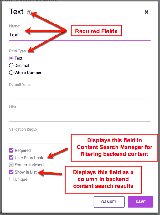
The following five properties are standard flags (properties with true or false values), each of which is available in many different field types. Each of these flags affect how the field is stored or displayed in dotCMS:
| Property | Description |
|---|---|
| Required | Check if the field is required (e.g. this field must not be left empty when adding or editing this type of Content). |
| User Searchable | Check to allow users to search the data in the field. Fields with this value checked will be individually searchable when searching for content. If this is checked, the content will automatically be indexed. |
| System Indexed | Check to cause the field to be indexed. This enables search for the field, but increases the size of the search indexes. |
| Show in List | Check to allow the field to display in the search results list when searching for content. |
| Unique | Check to prevent duplicates in the field. This ensures that no two content items have the same value in this field. |
Different flags are available for different Content Type fields; the following table summarizes the standard flags available for each field type:
| Field Display Type | Required | User Searchable | System Indexed | Show in List | Unique |
|---|---|---|---|---|---|
| Binary | Yes | No | No | No | No |
| Category | Yes | Yes | Always | No | No |
| Checkbox | Yes | Yes | Yes | No | No |
| Constant | No | No | No | No | No |
| Custom | Yes | Yes | Yes | Yes | Yes |
| Date | Yes | Yes | Yes | Yes | No |
| Date and Time | Yes | Yes | Yes | Yes | No |
| File | Yes | No | No | No | No |
| Hidden | No | No | No | No | No |
| Image | Yes | No | No | No | No |
| Key/Value | Yes | Yes | Indirectly | No | No |
| Line Divider | No | No | No | No | No |
| Multi Select | Yes | Yes | Yes | No | Yes |
| Permissions | No | No | No | No | No |
| Radio | Yes | Yes | Yes | Yes | No |
| Relationships | No | No | No | No | No |
| Select | Yes | Yes | Yes | Yes | Yes |
| Site or Folder | Yes | Yes | Indirectly | No | No |
| Tab Divider | No | No | No | No | No |
| Tag | Yes | Yes | Always | No | No |
| Text | Yes | Yes | Yes | Yes | Yes |
| Textarea | Yes | Yes | Yes | No | No |
| Time | Yes | Yes | Yes | Yes | No |
| WYSIWYG | Yes | Yes | Yes | No | No |
Field-Specific Properties
The following field-specific properties are available only to certain field types. Which parameters a field has (and which parameters are required) varies depending on the field type.
| Property | Type | Description |
|---|---|---|
| Data Type | Radio Button | Format of the data to be stored in the field e.g. Text, Decimal, Whole Number, etc.. |
| Validation Regex | Text | A regular expression (pre-defined or custom) that limits how data can be entered into the field. For more information please see the Validation Expressions documentation. |
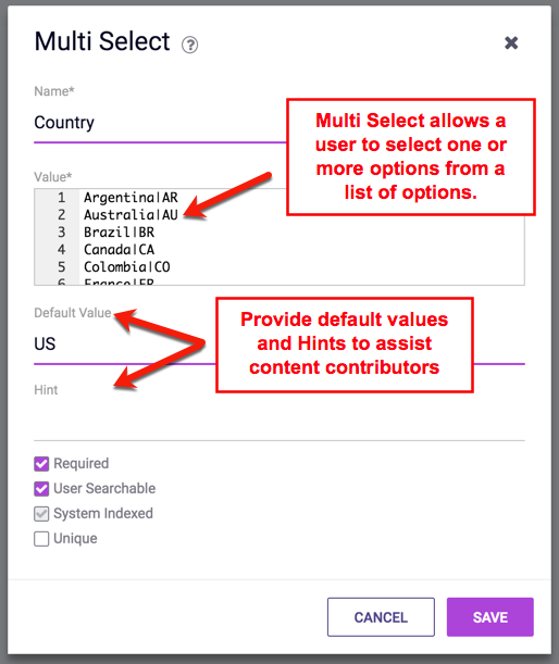
| Code/Value | Multiline Text | You must fill out this parameter for some field types (Radio, Multi-Select, etc.). Sample code/instructions are displayed highlighted in yellow to the right of the code field when this is required. |
| Default Value | Text | The default value used to automatically populate the field when a new Content item is added. Note: For fields with listed values (such as Select field), the value of the selection (rather than its label) must be used. |
| Hint | Text | Instructions to contributors on how to fill out the field. The Hint will be displayed to the content contributor on the Content editing screen. |
Necessary Properties
When adding a new field to a Content Type, some of the above properties are necessary; a field can not be saved unless all necessary fields are filled in. When editing the field properties, necessary properties are marked with an asterisk to the left of their labels, as shown in the Example below.
Specific Field Properties or Cases
Some field properties require specific values to handle specific cases.
Checkboxes
When defining values in a Checkbox field, note that there are two separate facets to each checkable item: a label and a value. Former is the visible text beside the checkbox item, and the latter is what dotCMS uses to differentiate them. The value component is not visible to the user.
The two components are both defined on the same line, separated by the pipe (|), as follows:
{label} | {value}
When configuring multiple default checked boxes, use a comma-separated list of values. For example, take the following checkbox definitions:
foo|1
bar|2
third item|c
This one is a ghost.|boo
In this case, to set the first, third, and fourth items checked by by default, set the Default Value input in the Checkbox Field's properties to the following:
1,c,boo
Date or Date & Time Fields
When configuring a default value in the properties of a Date field or a Date and Time field, you can use the value of now to cause each newly created contentlet of that type to use the time of its creation as its initial value.
Radio Fields
Similar to Checkbox fields, Radio fields distinguish between labels and values through separation with the pipe (|) character, in the following manner:
FirstLabel|1
SecondLabel|2
ThirdLabel|foo
Select Fields
When adding a simple “Select” list field, the first item in the list will become the default choice in the select list when the content contributor is adding content. To force the content contributor to make a conscious choice of an item in the select list do both of the following:
- Add only a pipe (
|) as the first choice in the select list (no label, no value) - Make the field required, so that the default first “null” choice is not valid, forcing the content contributor to click and choose an item from the select list
Multi-Select Fields
By default, the first value in a Multi-Select field is the default value. When new content items are created, the value of the Multi-Select field will be set to the first value listed unless the user manually changes it.
To force a user to manually select a value from the list (instead of using a default value), do both of the following:
- Add only a pipe (
|) character as the first choice in the select list (do not include a label or value on either side of the pipe character).- This configures the field to have no default value (the user must manually select a value, or no value will be saved).
- Check the Required parameter for the field, so that the default first “null” choice is not valid.
- This forces the content contributor to click and choose an item from the select list before the content item can be saved.
Multi-select fields do NOT need any special handling. Multi-select fields always force the contributor to choose a value, otherwise the field is left blank.
Field Variables
In addition to the properties available to each field, for many field types you may also add field Variables, which extend their functionality. For example, a field of the Binary Display type may be limited to only allow certain types of files to be uploaded, and to limit the size of files uploaded.
Read more about field variables.
Variable Names
Each field is automatically assigned a unique variable name which is used to reference the field in Elasticsearch queries, Velocity code, and REST API calls such as the content API and GraphQL.
How Field Variable Names are Generated
You can not choose what variable name to give a field when you first create the field; the variable name will always be assigned automatically. All variable names are assigned to fields as follows:
- The field variable name will be generated from the name of the field when it is created.
- All spaces and punctuation in the field name will be removed.
- All letters will be converted to lower-case to create the variable name.
- Multi-word names will capitalize the first letter of each word after the first, resulting in “lower camel case” naming.
- Example: A field name of
This Is A Fieldwill yield a variable ofthisIsAField.
- Double-byte characters are not supported in variable names, and will be replaced with an underscore (
_) in the variable name.- Unfortunately, this limitation is due to limitations in several of code languages used to access dotCMS content, not due to dotCMS code itself, and can not be changed at this time.
- If a new field results in the same variable name as a the variable name of an existing field, or a built-in or reserved name, the new variable name will have an incrementing number appended to the end to distinguish it from the existing name.
Field Variable Names Can Not Be Changed
In order to ensure that code which references field variables does not break when you rename fields, it is not possible to change the variable name of a field after the field has been created.
However you can create a field with one name, and then change the name of the field after the variable name has been automatically assigned. This allows you to initially create the field with an appropriate name so that the appropriate variable name is generated, and then change the name of the field afterward.
Two common cases where this may be useful are:
- If you have a field with a name other than “Title” which you wish to be treated as the
titlefield (which is automatically indexed for all content, regardless of the Content Type). - If you wish to create field names using double-byte characters, but want the variable names to be more descriptive than the automatically generated variable names (consisting of mostly underscores and numbers).
Examples
The images below show examples of some of the different field types.


